Did you get your first web design project?
Don’t be afraid! This post will help you with some tips and advice on how to design for the web. Through the years, we’ve teamed up with designers and design agencies, and we’ve noticed that graphic designers have a hard time designing for the web. Stemming from that, we have compiled a list with the most common questions and issues we’ve faced while working with my colleagues.
“What software should I use?”
It’s important to use the appropriate software when designing (print or digital). The right tools can help improve both the design and development process. Web design focused software include Sketch (only for Apple), Adobe XD and Figma. The main advantage of using a web design focused software instead of Photoshop or Illustrator, is that your file will be development ready. Your developer will get the exact specification of sizes, colors, and styles exactly as you designed them.
“How do I work my design?”
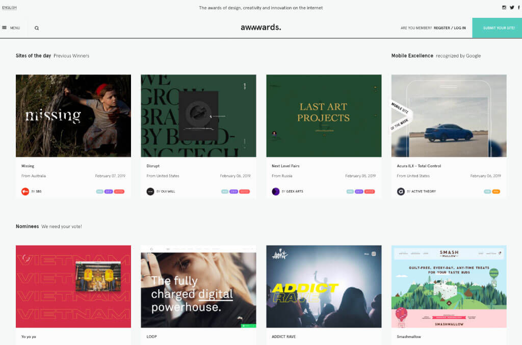
It’s very important that before even thinking about designing, that you search for inspiration, search for different websites. Search for conventional and non-conventional. Look at these websites, not only for their graphics but their structure. Is their content reaching the sides? Are the backgrounds 100% the width of your browser or they just cover the content? How many columns do they use, if any? What type of effects are they using on the typography? How big or small is their font size? The images? Observe and absorb what you like and what you think would apply to your client’s site. Then you can start designing.
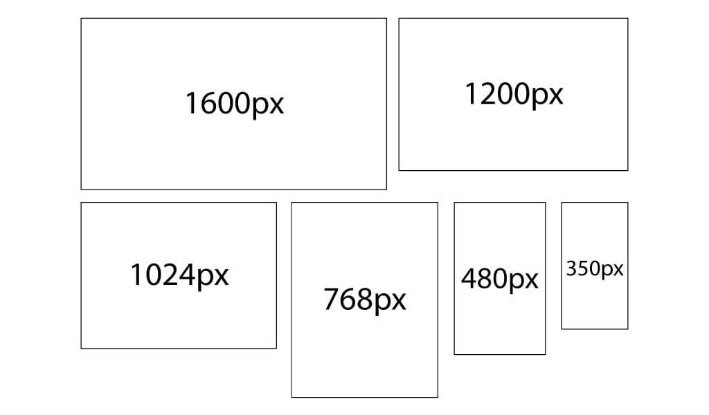
“What size should my canvas be?”
The go to is always: Large desktop, desktop, tablet, big cellphone, small cellphone. And what about the sizes of each? Each size is called “breakpoint”. When the browser or screen hits a certain width, it will “break” into the arrangement that we need.
So, what sizes should your breakpoints be?
What we always ask for: 1600 to 1440px for large desktop, 1200px for desktop, 1024px for tablet, 768px for big cellphone, 480px for small cellphone. (If the design for 480px doesn’t adapt well to a smaller screen, we ask for an additional 350px design).
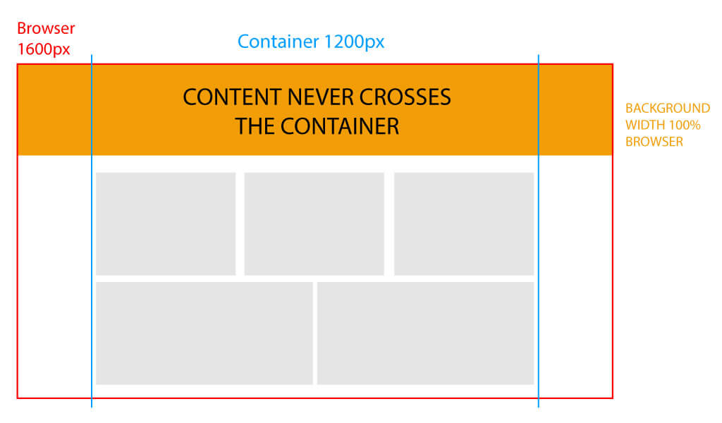
“What about my content? How do I know where my content should start or end?”
Work with your file at 100% zoom (This is very important). Imagine your canvas is your browser. Now, delimit the space you want your content (note: your backgrounds don’t count as content, content are your text and images). Usually, designers vary the size of their container depending on their personal taste. Some use 1200px, some use 1024px, some even 960px. You are the designer, so these things are for you to decide, what looks best and goes best with your client’s needs.
Tips for your content:
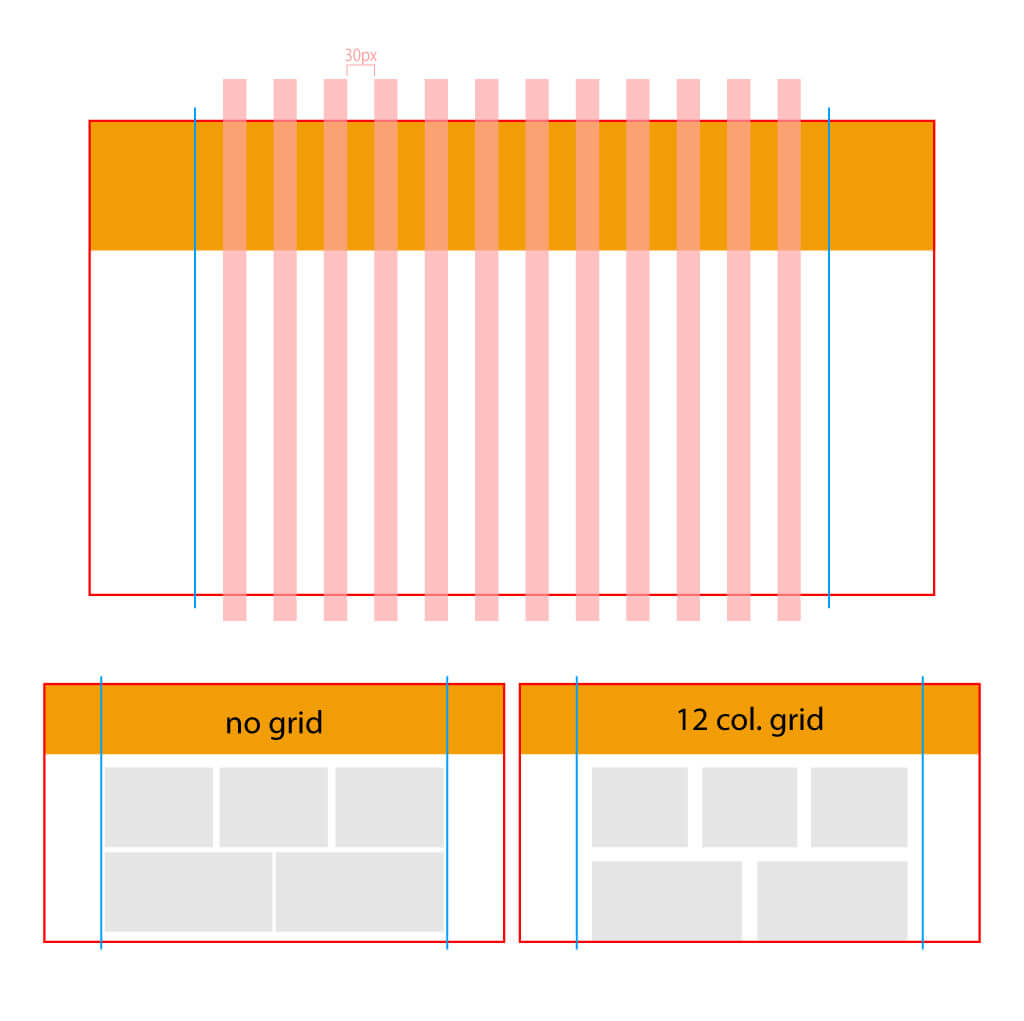
Always use a grid, this will make your life and your developer’s life a lot easier. The standard in the developing world is 12 columns with 15px of padding on each side (in total would be 30px in the gutter).
You can always put content in the padding area and your developer will make it work, however, please try to follow the main 12 columns, both your design and the development will turn out better and smoother.
You have your file all set up, time to start your design
Remember that you are designing for the web. And you want your design to be loaded as fast and as smoothly as possible.
File Format
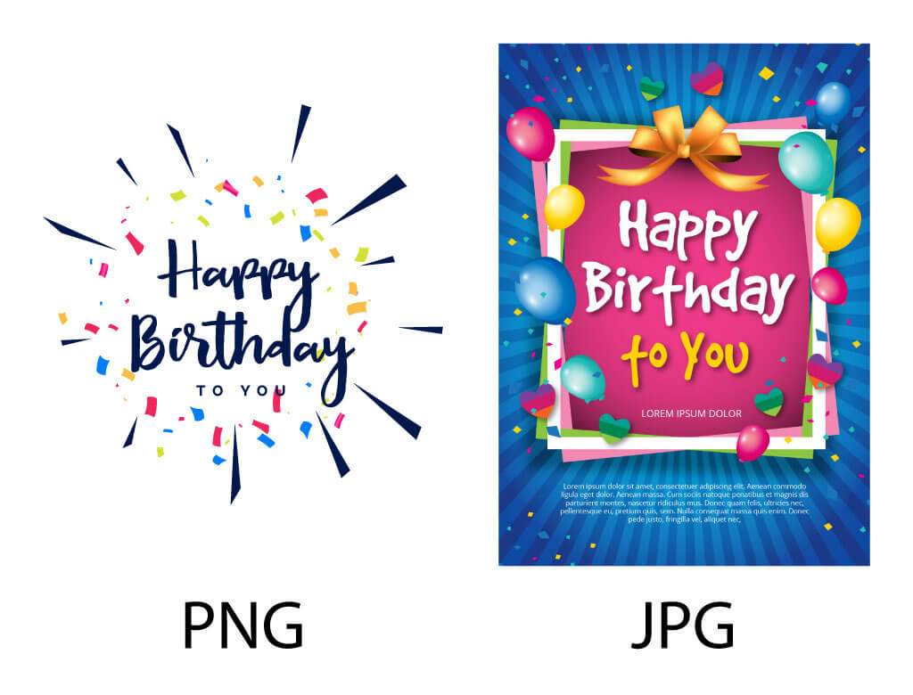
JPG when JPG is needed, PNG when PNG is needed.
If you are exporting your images to send a package to your developer, be mindful of the file formats and sizes. It’s recommended to use PNG for any image that has transparency, crisp lines (like vectors) and little color. JPG is best for photos and images with lots of colors.
Always use “Save for web” when exporting. This will make the image 72dpi, reducing it’s file size to internet friendly. If you want to go a step above, you can use a compression website to make your images even smaller in file size (without affecting their quality) for example tinypng.com I’m sure there are others so feel free to use any compression website/program you like.
Background
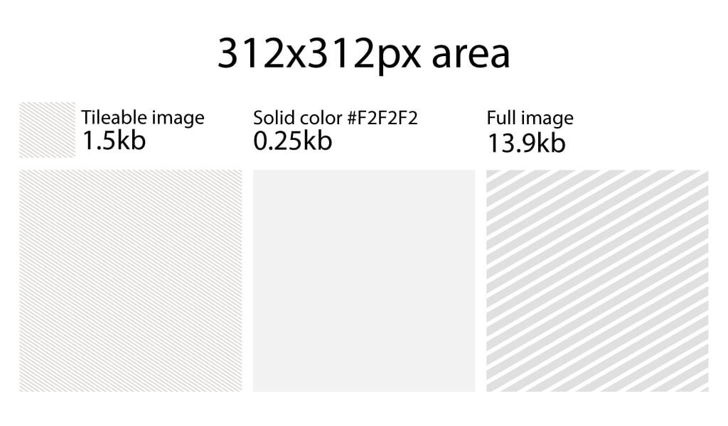
Backgrounds should be as small or as optimized as possible. For example, one of the most common mistakes is to not consider the size of their background, or how their background interacts with their content. Sometimes we end up with a 1200x800px PNG that could have easily been two 300x300px images, taking way less space and less loading time.
Try to use backgrounds that don’t need to be exported as an image, or backgrounds that work with a small image that repeats itself and tiles perfectly. We know this can’t be always the case but if you can, please do it.
Content interaction with the background
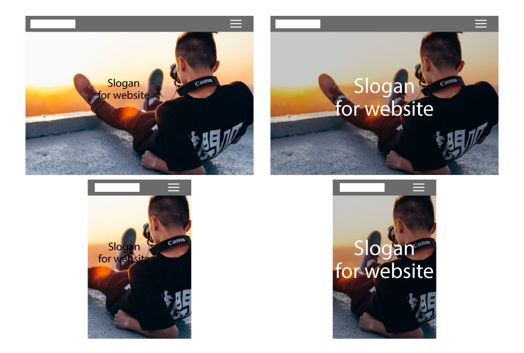
When designing for web, do not make your content or text in a way that gets merged in the background. Remember, your website is responsive, so everything will move and change depending on the browser size. (We’re not talking about breakpoints since in between breakpoints are tons of variations for monitor displays).
What looks good on your 17” MacBook will look different on a 15” display. You are designing for all display sizes.
Choosing your font
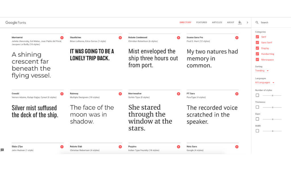
Only use fonts that are optimized for the web. Why? Because a non-optimized font won’t look the same between browsers and loads slower. We recommend using Google fonts. These fonts are tested, optimized, and probably already cached on the user’s computer (and free!).
It’s also advised to avoid loading issues by not using more than 2 fonts on your website. If you are working with an international website with multiple languages. Make sure the font you are using is compatible with different languages.
Ask your developer!
If you already know who you will be teaming up for your project, ask your developer if your idea is plausible for a website. It’s always best to be sure what you are showing to your client is achievable. Your developer will be glad that you asked for their opinion first and might even throw some advice on how to do a workaround in case it’s something out of the budget.
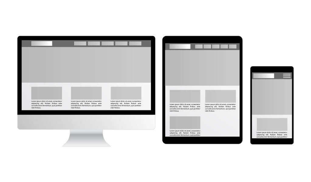
“I have my desktop design, how do I design the responsive?”
“Responsive” means to optimize the way to display the design. Rearrange content to make it easier for the user to read or explore the site on different screen displays.
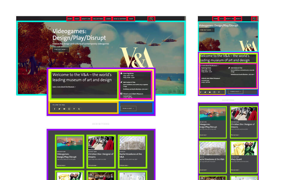
This doesn’t mean that you will have a completely different design on each breakpoint. It means you will take 4 columns and make them 2 on tablets because it’s easier to read, and 1 column on mobile because the screen is so small that it’s more comfortable to read.
It’s also important to respect the order of your elements. For example, it’s not ideal for an element in your footer to disappear and appear in the middle of the content area. Why? Because design wise doesn’t make much sense. Try to achieve consistency.
Tips to rearrange your content:
Think of your elements as boxes within boxes. This boxes “fall” once they have no space to go to. Your content will dictate how it will be rearranged, your job as a designer is to make sure it looks good and easy for your user to navigate. (paddings, font sizes, margins, placement of photos, etc.). This doesn’t apply to your navigation bar. For instance, your developer will hide your desktop nav and change it for your mobile nav (which is usually a hamburger menu).
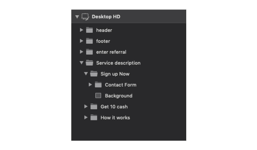
“My design is ready. How do I send it to the developer?”
File organization is very important. If your developer asked for your PSD or AI file, name your layers. Group in folders and delete any unused elements. This will help make your file lighter in size and help your developer to work faster. Also, send the final version (your developer doesn’t need temporary files).
Those are all the tips we have for you today. Good luck with designing your first website!